top of page
IDENTITY, PRINT, WEB
2022- 2024
Fibrus is a local Northern Irish Altnet (alternative network).
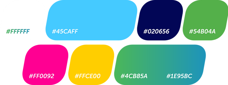
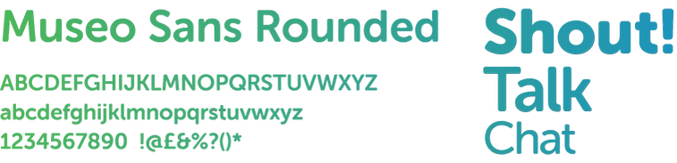
Fibrus' business goal is to deliver full-fibre broadband to homes and businesses across the country. The identity of this alternative network is a bit more complex. The name "Fibrus" comes from the fibre optic cable infrastructure at the core of their business, and I took that name literally. "What if we featured the bright iridescent fibre optic cables" along with simple geometric shapes taken from the original brands recognisable logo, throw in a smooth sleek sans-serif typeface, and a five colour palette with a delicious green blue highlight showcasing the rural communities where they deliver broadband.


Wordmark
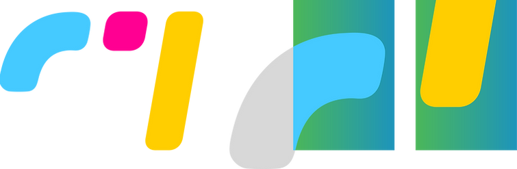
Logomark
Photography
.png)

Colour
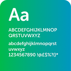
Type
Iconography

Holding Devices
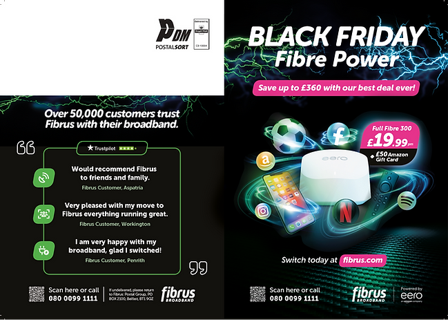
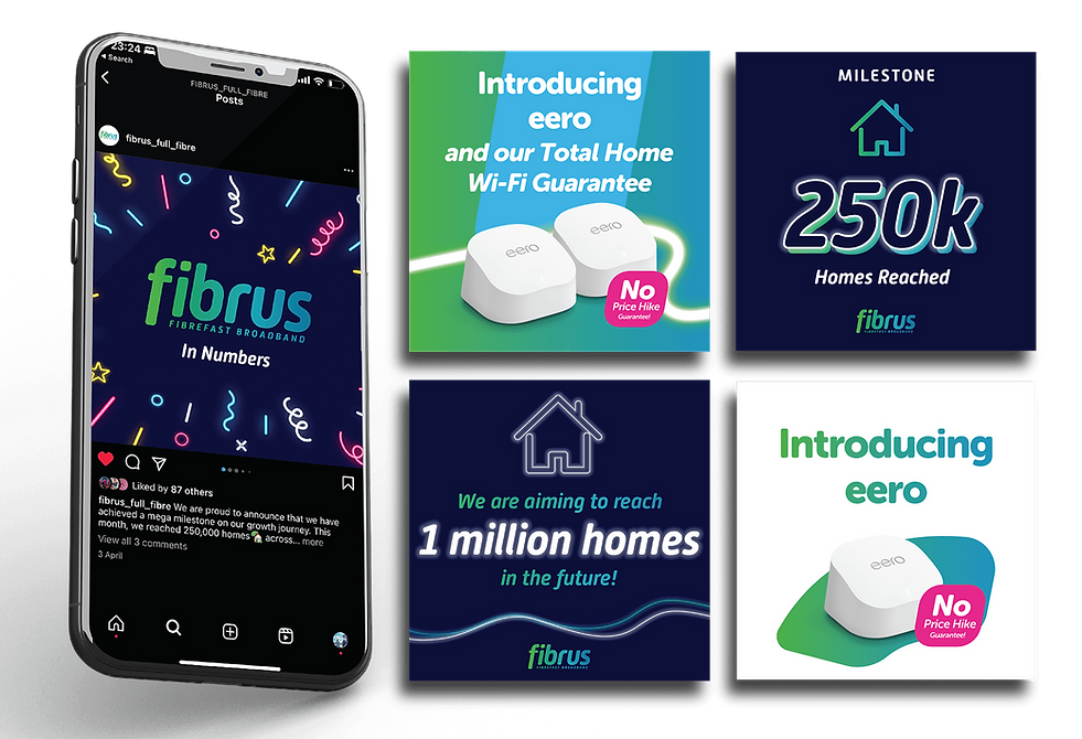
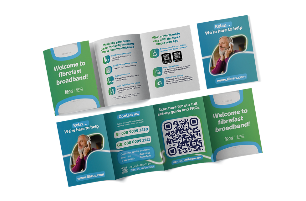
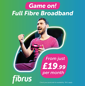
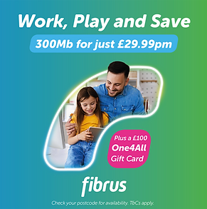
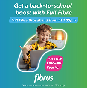
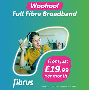
Campaigns


.png)
© 2024-25 Ben Snelling. All Rights Reserved.
bottom of page